| Items | Qty | Price | |
|---|---|---|---|
| $0 |
$0
After checkout, we'll ask you to upload artwork or submit your design brief.
No items in your cart
Hide Cart
×
| Items | Qty | Price | |
|---|---|---|---|
| $0 |
Since origami arrived on the scene around 17th century AD, man has been fascinated by folding paper. At First in Print, our fascination involves designing for, printing on, and then folding the paper! Enter the brochure…

Brochures are kinda like the middle child in the marketing materials family. They’re more complex than a flyer, and not quite as extensive as a booklet. The fold of a brochure makes it special. A well-designed brochure unfolds in a deliberate fashion in order to provide the reader with a unique experience. The brochure is a wonderful means for you to tell a story, educate a patient, or describe a product or service.
First, there’s the front cover. You must convince that person that your brochure is worth picking up and opening. You need beautiful visuals, and a captivating headline. Maybe your headline inspires contemplation by asking a question, or evokes emotion by making a bold statement.
Next, there’s the interior. This is the meat (or tofu if you prefer) of your brochure. This is where your mission is accomplished. You must captivate the reader, educate them, entertain them, intrigue them, and finally compel them with a clear call to action.
Finally, there’s the back cover. The back of the brochure is commonly used for informational purposes. You may put a map to your location, your email address, your website, and your phone numbers. If you have a particularly large brochure, you may add some supplementary information here as well.
The back of the brochure is where your reader expects to find all the information and tools necessary to comply with your call to action from the interior. You may even repeat your call to action at the top of the back cover.
The average person is exposed to over 500 brochures in any given year. OK, that’s a made up statistic… but think about it. How many mechanics, restaurants, dentists, doctors, banks, and optometrists have you seen this year? Many of them had a waiting area full or brochures.
A restaurant menu is really just a brochure… it’s designed to educate you about the meal options they have available for your purchase. A restaurant may not be as concerned with whether or not you’re going to open their brochure – but you can bet that they are hoping you comply with their implied call to action, which is simply… “Eat Here!”
Carry layout elements across creases and folds – There’s a time and place for coloring within the lines, and it’s not always on your brochure! Step outside the box and let your backgrounds and images transcend these boundaries inherent to brochures.
Tasteful use of color and contrast – Using different colors in your backgrounds can really add diversity to your layout. If you have a dark background on the front cover, consider a lighter background on the inside. Tastefully done, the drastic tonality changes will keep your reader guessing.
Custom Die Cut Brochures – You can do a lot with a die cutter! You may add a pocket or some business card slits to your brochure. You can add a perforation so that the reader can tear off a coupon or some relevant information. You can cut out a window so that certain elements show through from the next section.
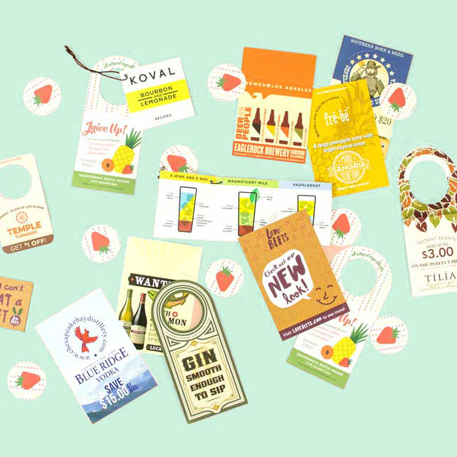
Here are some creative brochure designs that I have collected from around the web. Take a look and get inspired!


