| Items | Qty | Price | |
|---|---|---|---|
| $0 |
$0
After checkout, we'll ask you to upload artwork or submit your design brief.
No items in your cart
Hide Cart
×
| Items | Qty | Price | |
|---|---|---|---|
| $0 |
In wine and spirits, pricing is part science, part art, and — let’s be honest — a whole lot of perception. And one of the most reliable ways to nudge that perception upward? The label in the customer’s hand.
Wine Intelligence found that labels with tactile elements — embossing, textured paper, specialty finishes — increase perceived quality and justify price premiums of $2–$5 per bottle. On a $15 wine, that’s a 13–33% bump. On a shelf where margins matter, that’s a toast-worthy difference. 🥂
Here’s the thing: shoppers aren’t pulling out calculators in the wine aisle. They’re making fast, emotionally-driven calls about whether a bottle feels worth it — and the physical label is one of the loudest signals.
The Journal of Consumer Psychology found embossed or textured packaging increases perceived quality by 24%. Sappi’s research shows premium print finishes are perceived as 28% higher quality and support 15–20% price premiums over standard flat printing.
University of Michigan haptic research? Soft-touch coatings increase perceived luxury and willingness to pay by 15–20%. On a $30 spirit, that’s a $4.50 perception lift — enough to comfortably move into the next price tier.
Your label isn’t just identifying what’s inside. It’s telling people what it’s worth.
Each finish brings its own personality to the bottle:
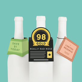
Foil stamping says celebration and prestige. Nielsen’s Innovation Lab found foil elements correlate with a 17% higher shelf pick-up rate. Foil catches light like a little party invitation, drawing eyes from across the aisle. Perfect for gift-purchase occasions and special moments — which, let’s face it, is what wine and spirits are all about.
Embossing and debossing say craftsmanship and heritage. That raised or recessed texture is a physical metaphor: “Extra care went into making this.” With a 24% quality perception lift, embossing is one of the highest-ROI finishes you can choose.
Soft-touch coatings say modern luxury. That velvety matte feel reads as sophisticated and premium without being fussy. It’s increasingly popular in premium vodka, gin, and high-end wine — the “I have great taste and I know it” finish.
Textured paper stocks say authenticity and artisanal heart. Heavier substrates activate what Sappi calls “processing fluency” — your brain feels the weight and texture and thinks, “This brand is trustworthy. This product is quality.” All before reading a word.
Spot UV adds dimension and intrigue. The interplay of matte and gloss surfaces creates visual and tactile depth that flat printing simply can’t match. Versatile enough for premium craft through ultra-luxury.
Here’s where the magic compounds. Peck and Shu (Journal of Consumer Research) found touching a product increases willingness to pay by up to 50%. Citrin et al. (Journal of Business Research): shoppers who physically touch products are 2–3x more likely to purchase.
So the happy sequence goes: 1. Visual charm (foil, color contrast, distinctive design) earns the shelf pick-up 2. Tactile delight (embossing, soft-touch, texture) builds ownership and quality perception during the hold 3. The combined effect makes the premium price feel completely right
Each step feeds the next. A visually stunning label with a flat, cheap feel? Breaks the spell. A beautifully tactile label nobody picks up? Never gets its chance to shine.
Incremental cost of premium finishes per label: Typically $0.05–$0.30 depending on techniques.
Price premium supported: $2–$5 per bottle (Wine Intelligence), or 15–20% higher willingness to pay (Sappi/University of Michigan).
The ROI: Even at the high end of finishing costs and the low end of price premiums, you’re looking at a 10–50x return on the incremental investment. Find us another marketing spend with those numbers. We’ll wait. 😊
1. Get finish samples in your hands. You cannot evaluate tactile finishes on a screen. Period. (Plus, unboxing finish samples is genuinely one of the most satisfying parts of the label process.)
2. Design for the price tier you want. Your finish gives consumers permission to pay more. Dress for the job you want, as they say — same goes for bottles.
3. Use finish as brand architecture. Good-better-best range? Let finishes tell the story. Flat print for entry. Spot UV for mid-range. Foil and embossing for premium. Crystal clear hierarchy, zero words needed.
—
First in Print is a specialty printer for wine and spirits labels, with deep know-how in the finishes that command premium pricing — foil stamping, embossing, soft-touch laminates, and more. Let’s elevate your label together!