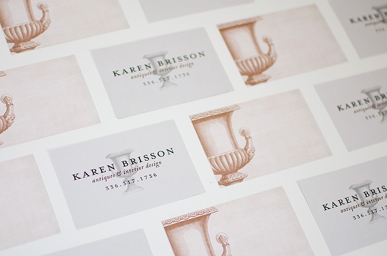


Karen Brisson is a vintage collector and designer, and came to us ready to refine her image.
Having used a traditional business card for many years, she was looking for a refreshing update that stayed true to her vintage aesthetic. The original design was stark and a bit severe with the high contrast and all-capital type.
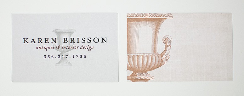
For the new design, the color scheme evolved to soft hues of gray and clay to create a more inviting palette inspired by her work.
Pulling key elements from her original card, we created a subtle linen texture to pair with the intricate new urn illustration. The front of the card presents the urn as a whole and highlights the shape, while the back of the card focuses in on the details. This reflects the way a person views a space- first as an overall view, then noticing the finer details that make up the space.