| Items | Qty | Price | |
|---|---|---|---|
| $0 |
Creative Business Cards – DOs and DON’Ts
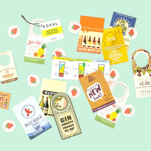
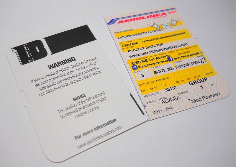
There’s never a dull moment in the wild world of creative business cards. You’ve got your spot uv business cards, your die-cut business cards, your folding business cards, and your completely out-of-this-world business cards.
One thing to be careful about when coming up with creative business card ideas is to bear in mind that a business card is actually a tool. It has a function, which is to share your contact information and perhaps a tiny bit about your business.
It should have some staying power. It should be creative, innovative, one-of-a-kind, and representative of your company’s vision. But please remember that above all else, it should be practical!
Here are some tips to help you create the perfect business card for your company…
- Make an impact – Your business card is often times the first thing somebody looks at when they are introduced to your company.
- Make it useful – Ensure that it contains all desired contact information, and that it’s up to date!
- Make it portable – See that it fits easily in somebody’s wallet or business card binder.
- Make it tough – Your business card should be rugged enough that it doesn’t get torn up too easily.
- Make it clean – You have a very small canvas to work with. Make effective use of the space available.
- Make it pop – Pay close attention to color, contrast, alignment, and proximity.
- Make it useful – Some businesses have the unique ability to add a schedule, calendar, or form to the back of their business cards. Think about creative ways to make your business card more than just a business card.
- Make it feel good – Business cards are not only seen, but also touched. No matter what line of work you’re in, you know a cheap business card when you are handed one. Don’t leave your potential customers thinking: “If they skimped on their business cards, what else have they cut corners on?”
- Make it accessible – Think about who your target demographic is. If your business caters to the elderly, you may want to consider extra large type.
Here are some things to avoid when creating your new business card…
- It’s not a brochure – Don’t try and make your business card into a miniature brochure. Sum up your business in a tagline or a very small bullet list. Don’t flood it with unattractive copy that nobody will bother reading.
- It’s not modern art – Don’t go overboard with reinventing the business card. Your card should not be carved on the side of a 2×4 piece of lumber. As memorable as this may be, it’s simply ridiculous and impractical.
- It’s not a side show – There are some really neat features available in modern business cards. Rounded corners, Folding, Custom Die-Cut Shapes, Spot UV, and much more. The trick is to use them tactfully… combining every gimmick available may not go over as well as a subtle, well-thought-out implementation.
- It’s not a postcard – Remember that the first thing people do when you hand them a business card is shove it in their pocket. If it’s too awkwardly big, it could end up in the trash that much faster.
- It’s not a guessing game – If your business name doesn’t make it crystal clear what you actually do, come up with a nice tag line that sums it up.
- It’s not a race – Take your time when planning your business card design. It’s a very important piece of your branding, and should be carefully thought out.


